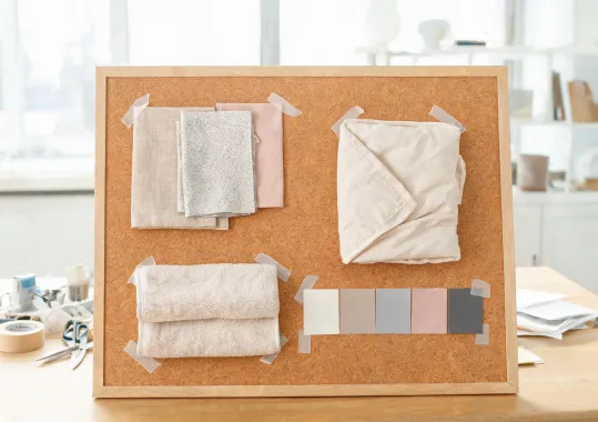
Warm white, oat, or sage base tones keep the bed bright without glare.
Design Studio
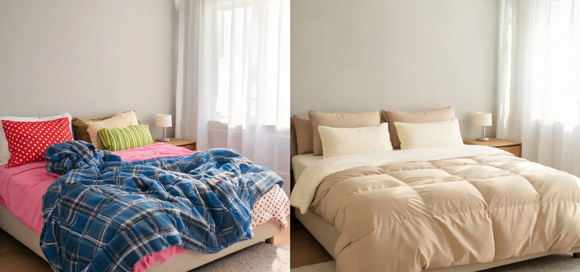
This studio comparison sets two rooms side by side. It studies how a room changes when sheet color, duvet texture, blanket weight, and bath tone are selected as one material language.
Explore TextilesInteractive layout concept

The studio begins with four inputs: room light, preferred touch, seasonal warmth, and care rhythm. Each input changes the recommendation. A north-facing bedroom may need a warmer neutral and a softer top layer. A hot climate may favor crisp sheets and a lighter waffle blanket. A high-turnover guest suite may need a protector, extra pillowcases, and a towel color that stays consistent across rooms.
The point is not a gimmick. The layout gives buyers a structured way to evaluate comfort and appearance before they send an inquiry. It also keeps design language precise: percale is crisp, sateen is smooth, waffle adds visible texture, quilted layers add order, and plush terry supports the bath program.
Warm white, oat, or sage base tones keep the bed bright without glare.
Percale adds snap. Sateen adds drape. Both can anchor a calm palette.
Comforter, quilt, and blanket weight are selected so layers do not compete.
Rotation notes keep spare sets, protectors, and towels aligned with actual use.
Case cards
A warm white sheet set, oat duvet, and sage accent blanket calm a room with dark wood furniture while keeping the bed visually light.
Swatches, touch notes, and care guidance are organized into a client-ready palette so bedding can be approved with the furniture package.
Sheets, protectors, towels, and spare pieces are specified for quick reset, consistent photographs, and fewer mismatched replacements.
Studio request
Send room photographs, bed size, preferred handfeel, climate, and care expectations. The Boll & Branch studio response can outline color, weave, and layer choices with practical product direction.